• Skip to primary navigation
  • Skip to main content
  • Skip to primary sidebar

Listen to Lena

Perfecting the Art of Conversuasion

  • All
  • Family
  • Lifestyle
  • Food
  • Travel
  • Fashion
  • Beauty
  • Decor
  • About Lena
  • Contact

PARA Paints

Reno-cation: Ryder’s Room

May 25, 2011 By Lena

Ta-da! I’m finally ready to start posting photos of my recent Reno-cation! I’ve decided to literally go from room to room – divulging details on what steps were taken, items I love, and where you can grab ’em. Then, don’t forget to tune in next month, when you’ll have a chance to win some of the goodies!

Disclaimer: The rooms aren’t “finished”, per se. There are instances where I’d like to change a piece of furniture, add a new picture or photo frame, or eliminate a style element… but don’t have the time or finances to do so at the moment. However, on the whole I’m very pleased with the small changes we’ve made, and am happy to present you with our recent mini-makeovers.

BEFORE

Since we’ve got four bedrooms and only two children, we have the benefit of having a home office upstairs. Pretty crucial when there’s a blogger in the house! Until recently, we used what the builder termed “Bedroom 4” as our study – its quite large and spacious, and we were able to create a work space, an area for me to scrapbook (a now defunct hobby – there’s just no time!) plus more than enough room for the kids to hang out so I can keep an eye on them. Trouble is, with Ryder growing and requiring more space for his personal effects, we felt it was time to move him into a “big boy’s room”. Before the move, he was in the bedroom beside our own, so having him relocate to the other side of the house has actually been tougher on mommy than him!

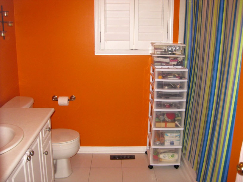
Ahem, did I mention that the room needed a healthy dose of spring cleaning? The closet was packed with literally every form of paper junk imaginable – wrapping paper, books, notepads, stickers, etc. etc. Here’s a shot of the room from the opposite angle, deep into the purge:

As you can see, the garbage bag was FULL. See the blue storage bin full of books on the left? All chick lit, my friends. Time to put the works of Sophie Kinsella to sleep.

AFTER

Ryder’s new bedroom…

Paint:

PARA Paints Picturesque Port, #P5011-24

Wall Decor:

Adzif “Ludo Tells a Story” and “Hip Hop” decals, purchased from DeSerres
Framed photos – DIY project I whipped together, displayed in NEXXT Suspense Frames
“LACK” wall shelf, purchased from IKEA

Furniture:

Denali, purchased from The Baby’s Palace

NOTES

I wanted Ryder’s room to be a happy, carefree place that would make him smile. His bright blue room is a far cry from the paint swatches I first considered – muted, mellow and “meh” colours. Somewhere along the way I decided to abandon what others would like… and paint for what Ryder would like! Great news – he LOVES his new room, and says goodnight to the Ludo sticker every night!

The furniture certainly doesn’t fill the room, but once Reid outgrows his crib, it will convert to a double bed which will be Ryder’s to enjoy (Reid will inherit the toddler bed pictured above). So in a few short months, what looks like a huge bedroom will actually be balanced a little more effectively with the right mix of furniture.

PARA Paints generously provided the paint for my entire home, and let me just say that I couldn’t be happier with the selection of colours and finishes. My father-in-law, who is a professional painter, commented that the paint (PARA’s Ultra latex interior) provided superior coverage with mess-free application. More on PARA Paints to come!

One room down, lots more to go! Stay tuned…

Filed Under: Lifestyle Tagged With: DeSerres, home decor, Ikea, PARA Paints, Reno-cation

Reno-cation: The Great Room

May 24, 2011 By Lena

Thanks to everyone who left such wonderful feedback on Ryder’s Reno-cated room. I feel a surge of happiness every time I hear him say, “I like my new room! It’s blue!”

Now the logical thing would be to show off the next bedroom in sequence, BUT, because I have two little boys, and because taking pictures is dependent on which area of the home is tidy at the moment, let’s skip to my main floor – where I’d like to introduce you to my new “Great Room”.

Here’s the scoop: when we first purchased our home, we spent hours going over the floor plan, considering how to set up our domain. The builder had laid out the main floor as depicted on the right (note: foyer, powder room and garage not pictured). So without going against the proposed plan, we proceeded to set up four (4) distinct areas: a family room at the back of the house and a combined living/ dining/ entertainment area in the front of the house.Just in case you’re wondering… all the furniture was purchased literally weeks before I found out I was pregnant with Ryder (who was a most welcome surprise)… so brace yourself – you’ll see a lot of light-coloured furniture that is so telling of a couple who hasn’t considered the joys of sticky fingers and grape juice.


Now having a home that is almost completely an open concept is both awesome and frustrating; awesome because the house looks large and modern – frustrating because all the furniture and décor has to complement each other and lend to a continuous “look”.

Well, this July it will be four years in our home, and we finally came to realize that we spend exactly 99.9% of our time holed up at the back of the house in the family room, and 0.1% of our days in the blended living/dining/entertainment area. Which is all the more tragic considering what a colossal waste of space it is!So I finally decided to do something about it. Instead of having three separate “rooms” upon entering our home, I relocated hubby’s bar to the basement, moved our dining furniture into the family room, and turned the front of the house into a Great Room – which is a much more intelligent use of space. Since the area is quite large, let’s do the “Before” pictures in comparison to the “After” shots one room at a time. You may click to enlarge photos.

BEFORE/AFTER
BEFORE – LIVING ROOM
AFTER – TV AREA
BEFORE – DINING ROOM
AFTER – GREAT ROOM
BEFORE – BAR AREA
AFTER – STILL THE GREAT ROOM!

Paint: 

PARA Paints Nature’s Bounty, #P5227-24

NOTES

We love our new Great Room! And, we’re finally enjoying the awesome space in our home! I didn’t include pictures of the family-room-turned-dining-room because I’ll be posting about that separately later this week.

Re: our paint colour choice, since all the rooms mesh together… plus all the way up the stairs and through the upper hallway (did I mention we have an open concept? sheesh) we couldn’t really afford to go too crazy. I chose a very safe mix between beige and taupe… but you’d be amazed at how different the colour looks in different lights! In natural light, it’s downright taupe; with our lighting at night (which has a strong golden hue) the paint tends to look almost a pale yellow (as in the photos above). Regardless, it’s the perfect colour to set off our dark furniture and hardwood, and blends seamlessly with our green kitchen (yes green – but trust me, it’s a nice green).

The sectional was purchase from The Brick several moons ago but in our new room, we feel it takes on a contemporary (but timeless) look.

I also wanted to point out this neat little gadget we picked up at Home Depot: since we live in a semi, it was virtually impossible to fish the wires through the concrete once we mounted our TV. So instead of leaving the wires hanging (yuck!) we found this nifty Flat Screen TV Cord Cover Kit to hide the unsightly cables. A bonus: it can be painted to blend with your wall!

More Reno-cation wrap up to come!

Filed Under: Lifestyle Tagged With: home decor, Home Depot, PARA Paints, Reno-cation

Reno-cation: Master Bedroom

May 23, 2011 By Lena

My Reno-cation wrap up continues!

On to one of my favourite rooms – our master bedroom. My husband had just one teeny request: make it resemble a guest suite in Chicago’s W Hotel, where we had stayed during our engagement. Easy peasy, right? Ha!

Well, thankfully I had a few things going for me –

a) A spacious master bedroom
b) A cream couch without a home since we merged our living and dining rooms
c) The desire to add a touch of modern elegance to an otherwise boring bedroom

(Unfortunately, no mini bar.)

Aside from my beloved Urban Barn “Yoshi” bedroom set, my “before” look was sadly lacking inspiration.

BEFORE

Choosing a paint colour for the room was simple – I had my heart set on a smoky purple. It had to have just enough lavender to be pretty, but with a healthy dose of grey for an edginess that hints at contemporary styling. In other words, very W Hotel. 

It took literally seconds for me to settle on Big Shot, #P5195-44. I’ve attached the paint chip here because I only had a chance to take pictures at night – and my camera’s flash pulled out too much gray from the walls, making it very hard to decipher the true colour. Now isn’t that the perfect smoky purple? It’s like PARA created it just for me!

And…ta da! (You may click photos to enlarge)

AFTER

NOTES

After Ryder had his little tumble off our bed, I decided to relocate the night tables for the time being – and was pleasantly surprised to see how well they work as side tables. The location of the sofa is perfect for lounging with a good book (and late morning sun), and is also practical for watching the tube (though we definitely prefer reclining on the bed to catch our favourite TV shows).

To complement the green in my duvet cover I purchased fairly cheap lamps from Bouclairin a jazzy shade of fern green – but once in the room, they suddenly took on a very chic and contemporary feel. Shh… don’t say a word, but they were just under $15 each (they still appear on the website as $44.99 each but were definitely marked down in-store).I bought the abstract picture of New York City, also from Urban Barn, some time ago… but could never find the right home for it. Now, I’m so pleased with the way the wall colour sets off the vivid strokes in the painting. Perhaps New York W instead?

All in all, we’re pretty much in love with our new bedroom. Although it may look a tad cool and impersonal, did I mention that we have the cuddliest duvet in the entire world? Lots of snuggle time!

Just a few more rooms to go! Next up on my Reno-cation wrap up… it’s Reid’s room!

Filed Under: Lifestyle Tagged With: Bouclair, home decor, PARA Paints, Reno-cation, Urban Barn

Reno-cation: The Study

May 22, 2011 By Lena

I like to call this room “Listen to Lena! Control Central“.

It’s my home office: the place where ideas take shape, blog posts are written, and bills are paid. I also spend a lot of time on UsMagazine.com.

Having an upstairs study is my favourite use of a spare bedroom. I can stay close by while the boys are napping, and since I like to be cozy at all times, it sure beats hunkering down in the basement. Plus, I’m an authentic daydreamer, so having a window to gaze out of is a definite bonus ;)

Our previous study was located in one of the bigger bedrooms over the garage; it has seen been transformed to Ryder’s bedroom. We had originally chosen a large room because I also needed an area for scrapbooking (a now defunct hobby). One we scaled back and organized ourselves a bit, I realized that our new office would be perfected suited to “Bedroom #3” – Ryder’s old play room.

Peeling off the colourful stickers and saying goodbye to the paint – a bright yellow called “Tigger’s Tummy” – was definitely hard. Ryder had some good times in his little room! But as we’ve since finished our basement, and he’s now got a little playmate to run around with, Ryder was anyways spending less and less time in the play room.

BEFORE

As I sit in my new office and type this post, I’m hit with a wave of nostalgia for that little boy who zipped around this room, throwing his toys everywhere. FYI – before removing the green mirror pictured above, we noticed that Ryder is now at eye level with the top of the frame. Crazy!


AFTER


Paint:
PARA Paints, Swim Trunks #P5158-34

NOTES


My husband picked the colour in this room – he had a clear notion of what an “office” should look like. Therefore we went for a very unflashy bluish grey. I’ve once again attached a paint chip as my camera has pulled mostly grey off the walls, whereas in person, I actually see more blue than grey.

We relocated the floral painting which you may remember originally hung over our bed to inject some friendliness into an otherwise crisp room. I reserved the opposite wall for my mammoth whiteboard, which aims to keep me (somewhat) organized. (Sorry! Had to airbrush over the upcoming giveaways as I don’t want to spoil the surprise!)

With the addition of my two beloved HP printers (the B8350 prints on sheets up to 12×12″ – a must for scrapbookers) and the eStation (review to follow!)… plus my desktop and laptop… I LOVE my new office!

Filed Under: Lifestyle Tagged With: HP eStation; home decor, PARA Paints, Reno-cation

Reno-cation: Dining Room

May 21, 2011 By Lena

I mentioned yesterday that Reid’s room would be coming up next, but last night, I had a clean dining room (which goes against nature when you’ve got babies) so I decided to take the opportunity to post a few photos.

Who says you need to play by the builder’s rules? We raged against the blue print and created a space that works for our family. Yes, it’s the old switcharoo!

Carrying on the theme of Nature’s Bounty from the rest of the main floor, the room designed by the builder to be a family room is now in fact my dining room.

BEFORE

You’ll remember from a previous photo that my dining room used to be squeezed into the front area of the house. In this spot, it seldom saw use (we opted to eat at the kitchen table instead) and was just another fixture to dust.

Here is our previous family room setup –

Even though I enjoyed having the family room so close to the kitchen, I find I do a lot less snacking now that my fridge is no longer in view of my couch!

AFTER 

NOTES

As you can see, just a little bit of paint does wonders to bring out the deco detailing in the chairs. I can’t deny that it’s nice to have such an airy, open space for dining… a bonus: we eat dinner at this table every night now!

To give the dining room a less formal feel, and to keep me entertained while I cook, we tucked a 32-inch TV into the corner opposite the fireplace.

So, not a crazy renovation, but one that suits our home and lifestyle. That just about finishes my wrap up on the first floor… except for the kitchen, where I made one small (but pretty awesome) change. You won’t want to miss it – review to come!

Filed Under: Lifestyle Tagged With: home decor, PARA Paints, Reno-cation, Structube

Reno-cation: Main Bathroom

May 20, 2011 By Lena

My Reno-cation wrap up continues with my main bathroom. This was perhaps one of the hardest rooms to makeover, specifically because:

a) It was orange before. Yes, orange. Like a bright, happy, Home Depot orange.
b) I liked it orange.
c) No one else liked it orange.

BEFORE

Now I’m not exactly sure what drove me to paint the main bathroom in such a vibrant shade, but it just screamed “Lena!”. For contrast, I used stripes and circles in blue, green and white.

(In case you’re wondering, that’s a storage case filled with beauty products to review. I don’t actually own that much makeup!)

Alas, there was no middle road for this bathroom – visitors either loved it or hated it (curiously, those who vehemently disliked it were generally born before 1960. Just sayin’.) So when it came time for a reno-cation, I grudgingly agreed that it would be best to grab a more bathroomy colour from PARA Paints. A soothing mint green, anyone?

AFTER


Paint:
PARA Paints Big Girls Don’t Cry, #P5031-24

NOTES

Here’s another shade that can look slightly off in different lights. As you can see, the candlelight in the first shot makes the room look more bluish than green, but the second picture depicts what I believe to be the true colour – mint, pistachio, seafoam… whatever tickles your fancy. I picked up black Umbra accessories from Kitchen Stuff Plus (use this coupon to save 25% off one item until May 31st) and hung a framed photo depicting the vineyards of Sonoma, California.

(Hubby was watching an episode of The Nate Berkus Show where he insisted that your home decor should incorporate your most vibrant memories – hence a picture of our honeymoon destination beside the toilet, where I spent three months throwing up thanks to the honeymoon baby.)

I’m also pretty excited about my new shower curtain. Purchased from Sears during their recent White Sale, it features a gorgeous black and sateen silver damask pattern. It pairs perfectly with the milkiness of the light green, and as I’d been lusting after it for ages, I just couldn’t resist. Word on the street is that there are coordinating bath mats too… perhaps I’ll let my Visa take a breather before I explore that option ;)

Only a few rooms to go!

Filed Under: Lifestyle Tagged With: coupon, home decor, Kitchen Stuff Plus, PARA Paints, recipes, Reno-cation, Sears

Reno-cation: Here We Go!

April 19, 2011 By Lena

In case y’all are wondering what I was up to yesterday… I was watching this:

Turn into this:


Well, at least the TV hasn’t fallen off its mount… yet.

On the plus side, I’ve learned how effective dropsheets are at catching wayward cookie crumbs. No sweeping for me!

Filed Under: Lifestyle Tagged With: PARA Paints, Reno-cation

Primary Sidebar

Lena Almeida

Toronto Blogger, Social Media Strategist for Listen to Lena Inc. Television & Radio Personality, Columnist and Speaker. Family Travel Expert. Star Wars Fanatic. Perfecting the Art of Conversuasion. Read More…

Connect with Lena

  • Email
  • Facebook
  • Instagram
  • LinkedIn
  • Pinterest
  • Twitter

Featured

Guardians of the Galaxy: Cosmic Rewind, Virtual Queue Strategies

Five Cool Tips for a Backyard Ice Cream Bar

Beaches Turks & Caicos: Your FAQs Answered!